Character Illustration using mood boards

When designing websites, print design pieces, or anything else creative, there is almost always some type of direction to follow. Mood boards are excellent ways to follow a certain style or feel for something. Mood boards are basically an amalgamation of drawings, designs, photography, or anything else similar.
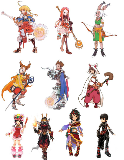
Instead of doing a web mood board, I wanted to design a character that was similar to the artistic style of Final Fantasy - specifically the Tactics series. I pulled images from the web of different concept art that was related to the game. Here is one of the mood boards on the left that I assembled to help with the creative process.
Design considerations
When I started to design a few different characters, I started putting them in crazy poses with all kinds of foreshortening and action poses. I quickly found out that this was not the best way to design them. Character designs are more geared toward finding overall balance, costumes, colors, and descriptiveness when working on them. Losing detail because of limbs being hidden or odd poses is sub-optimal.
Color is also a big consideration when developing the costumes. Too many different colors can make the characters appear too busy and detract from their face -which people end up concentrating on first. Too few colors make the character appear a little bland. The last two designs on the mood board above are nearing these extremes.
Final Character design

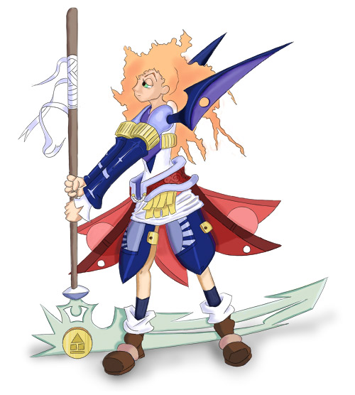
I tried to use strong colors like in most of the other samples. She has a little scythe that she is holding upside down. I thought it would add more stability to her pose by putting it upside down. It looks pretty heavy, so she would probably have to carry it on her shoulders if she wanted a comfortable pose standing still.
I echoed the shape of the scythe on a lot on her uniform accessories. I think this makes her appear that she is comfortable with her weapon and understands it well. She is ready for battle! Most of the characters weren’t smiling in the mood boards, so I did so as well with this. War is nothing to smile about, so I am guessing that is why most of the characters are so serious.
The color palette was a lot of primary red, yellow, and blue. Since her uniform is fairly elaborate, I thought that making her weapon a little more decorative and styled would help make it look cohesive.
I originally put a nice metal texture on the weapon, but it clashed with the clean metal everywhere else, so I removed it.
The chest plate area has some detail that can’t be seen, but the rest of the character has a good impression as to what is going on. Having a side view of the weapons shows the designs and detail the best.
I am fairly satisfied with the results. It is really easy to want to go crazy and do more detailing, but I resisted. The hardest part of these is knowing when to say enough. Anything cartoony looking has so much room to bring out detail in materials, anatomy or shading.
Page Contents

I mostly keep this blog to help me remember things. Writing is also a great way to understand things at a deeper level. I would highly recommend it if you don't write at all.